
As new cases of the Novel Coronavirus (now officially known as COVID-19) are reported, an interactive map developed by Johns Hopkins University (JHU) is providing near real-time tracking.
Built as an ArcGIS dashboard, the map pulls in information from a wide range of sources to be able to provide twice daily updates.
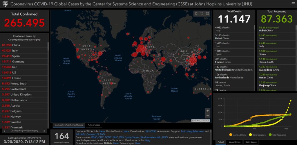
The live dashboard pulls data from the World Health Organization (WHO), as well as the centers for disease control in the US, China and Europe, to show all confirmed and suspected cases of coronavirus, along with recovered patients and deaths.
The data is visualized through a real-time graphic information system (GIS) powered by Esri.
Infact, through the GIS thecnology, the new Coronavirus cases are geocoded by city or place so they can be displayed on the map.
The aggregated data can also be downloaded for those that want to directly access the novel Coronavirus data.
The middle of the GIS dashboard is dedicated to a global map showing all reported COVID-19 cases by location.
Click on any location of novel coronavirus cases on the map and a pop-up will display information about the cases being reported there.
The boxes on the right side display summary information about total deaths and recoveries as well as location-by-location detail about cases.
To see the map of near-realtime confirmed COVID-19 cases visit:
If you’re visiting from a mobile device: